Case Study: NPP-USA, Inc.
Quick Highlights
- Project Span: 2016–2019
- Impact: 28+ U.S. chapters and wings unified under one identity
- Deliverables: Style Guide, Templates, Digital + Print Systems
- Recognition: Caught attention of NPP-Ghana leadership
Branding a Political Force
The NPP-USA identity work began with a practical problem: local chapters needed to produce their own materials while remaining recognizable as part of the same organization.
Different logos, fonts, and image treatments were appearing across communications. I helped develop shared visual standards and assets that chapters and wings could apply to their own messages.
The Challenge
The system needed to support local activity without requiring each group to solve the same design questions again. That meant making the standards understandable and the working files accessible.
Flyers, press releases, portraits, and event materials needed a shared reference, with enough flexibility for different content and occasions.
The Journey
Working with Obaa Yaa Frimpong, I helped put those decisions into practice across the materials being produced.
The work included font licensing, consistent portrait treatments, and organizing approved assets. Those production details mattered because many people were contributing files and using them in different settings.
I also worked through questions between content and approval stakeholders so the material could move forward with an understood direction.
The Solution
The NPP-USA Style Guide brought the identity and communication decisions into one reference. It covered:
- Logo usage standards for national and local chapters
- Color palettes balancing heritage respect and modern clarity
- Typography systems enforcing visual discipline
- Content templates for flyers, banners, formal statements, merchandise
- Language guidelines balancing boldness and unity
The digital work included page metadata and HTML/CSS structure, alongside the identity and production materials.
Technical Foundations
- Applications: Adobe Dreamweaver, Illustrator, Photoshop, InDesign, InCopy, Figma
- Languages: HTML 4 and HTML5, CSS 2 and CSS3
- Frameworks: Bootstrap
- Tools: Google Fonts, SEO Meta Structuring, Basic Analytics Setup
Contributions Overview
The scope extended beyond individual flyers into a collection of identity and communication assets for chapters, wings, and affiliated groups. The timeline below records the work described in this study.
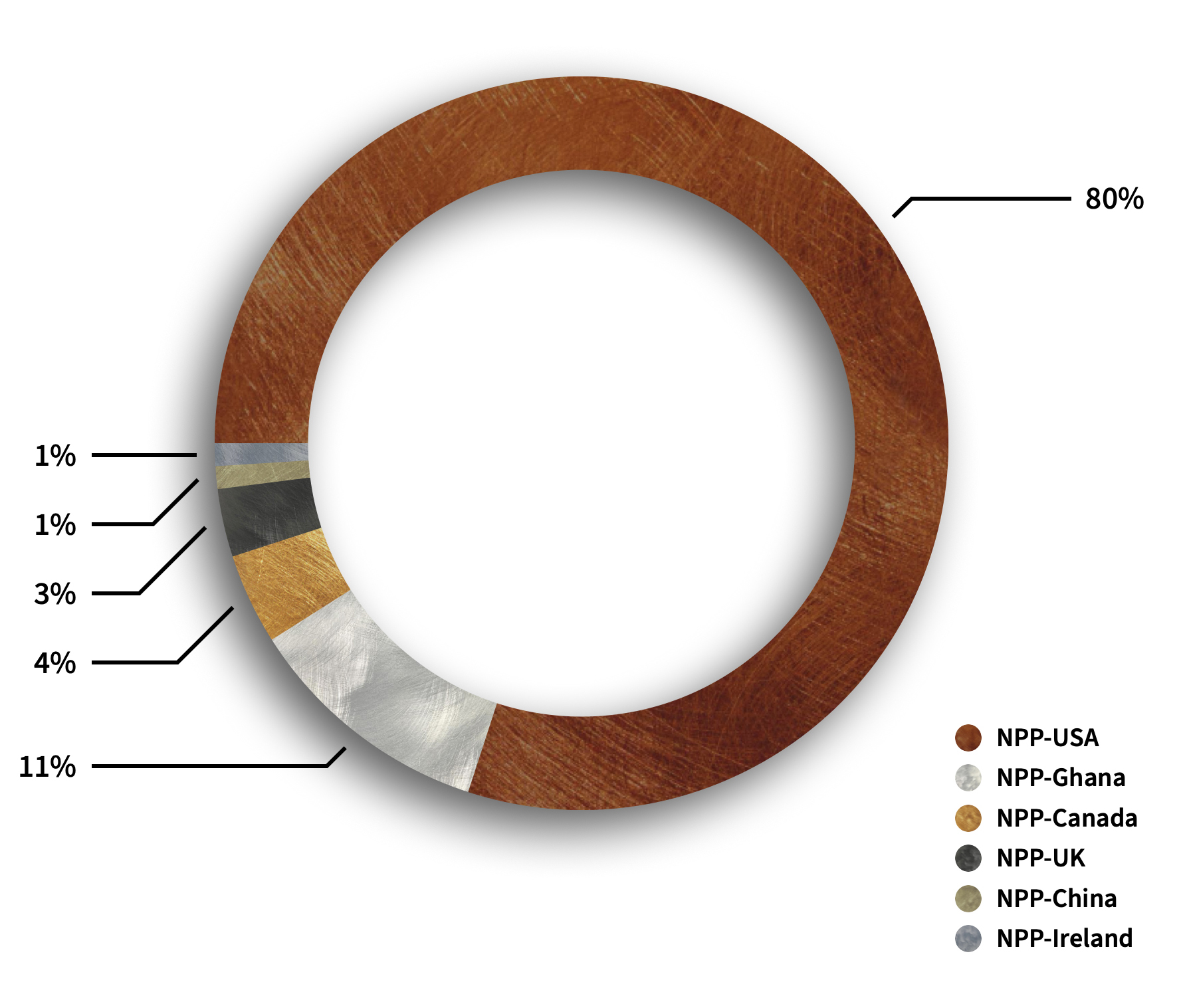
Global Contribution Distribution (2016–2023)
The chart shows the distribution recorded for this project. It describes the body of work, rather than an independently measured change in public perception.
The milestones below trace how the materials and supporting standards developed.
| Date | Milestone |
|---|---|
| January 2016 | Coordination launched to unify scattered branding materials across volunteers and early chapters. |
| March 5, 2016 | Official NPP-USA brand folder created, establishing centralized governance for materials. |
| June 14, 2018 | Central logo repository launched, standardizing visual identity across national chapters. |
| June 19, 2018 | Surge of multi-chapter logo rollouts; 28+ chapters and wings unified under a single system. |
| October 21, 2023 | Final recorded logo updates (Michigan Chapter), sustaining brand evolution across all levels. |
| Milestones Building a Lasting Global Identity | |
The archive brought together brand assets, campaign materials, and working files for recurring use. Its value was in helping people locate and apply a consistent identity.
Contributions supported organizational efforts in multiple territories including:
- NPP-USA (28+ Chapters and Wings)
- NPP-Ghana
- NPP-Canada
- NPP-China
- NPP-Ireland
- NPP-UK
Within NPP-USA, contributions supported key branches and agencies such as:
- Communications Department
- Women’s Wing
- Youth Wing
- Information Technology Department
- Campaign Committees (including 2024 Campaign)
- Regional Chapters: Atlanta, Charlotte, Chicago, Cincinnati, Colorado, Columbus, Dallas, Massachusetts, New Jersey, New York, Pennsylvania
The intention was to leave a system people could continue using as events, contributors, and leadership changed.
The Hidden Risks of Missing Information Architecture
The following table describes the coordination and production problems the system was intended to address.
| Challenge | Consequence |
|---|---|
| Visual Inconsistency | Colors, logos, and fonts varied wildly, confusing public perception. |
| Confused Messaging | No unified tone or language, different chapters sent mixed signals. |
| Internal Frustration | Volunteers and leaders wasted time guessing logo formats and visual standards. |
| Resource Wastage | Frequent reprints and corrections drained time and money. |
| Loss of Public Trust | Brand appeared amateurish, weakening credibility across communities. |
| Slow Emergency Response | No pre-approved templates slowed down urgent communications. |
| Fragmented Digital Identity | Websites, emails, and social media looked disconnected and inconsistent. |
| Chapter Isolation | Chapters felt disconnected from the national brand and each other. |
| Recruitment Difficulty | Potential members and donors were discouraged by the brand's disorganized image. |
| Leadership Overwhelm | Leaders had to micromanage branding tasks instead of focusing on strategy. |
| Legal Risks | Inconsistent use of logos and brand elements increased legal vulnerabilities. |
| Before: Branding Without Centralized Control | |
Strategic Transformation Through Centralized Branding
The next table connects those problems to the standards, templates, and asset decisions used in the work.
| Solution | Strategic Outcome |
|---|---|
| Standardized Branding | Unified national and international identity recognized across all channels. |
| Consistent Messaging | Clear, aligned voice across public statements, events, and campaigns. |
| Ready Templates | Instant deployment of events, press releases, and campaigns without chaos. |
| Centralized Resources | Efficient production with less waste and faster delivery timelines. |
| Strengthened Trust | Public confidence in the organization's seriousness and credibility grew sharply. |
| Digital Alignment | Consistent websites, emails, and social media branding elevated the digital footprint. |
| Chapter Empowerment | Chapters operated with pride under a unified national identity. |
| Smarter Recruitment | Professional branding attracted higher-quality members and strategic partners. |
| Leadership Freedom | Leaders focused on strategic growth instead of fixing branding issues. |
| Risk Mitigation | Brand consistency minimized legal risks around logos, materials, and trademarks. |
| After: Branding With Centralized Leadership | |
The Result
The resulting collection gave chapters and wings a shared visual identity and a practical set of materials to work from.
The contribution combined design with the organization of files, references, and repeatable production choices. The Pennsylvania Chapter gallery shows the identity applied across community messages.
A system like this needs maintenance as the organization changes. Clear source files and guidance provide a starting point for the people responsible for the next round of work.
We finally look like the movement we’ve always been.
Silent Flex: Future-Proofing
The handoff was intended to let future contributors continue and adapt the standards without rebuilding the identity from scratch.
Behind the Scenes: Realities of Building a Movement
- Defended licensed font usage to protect brand integrity across states.
- Structured chaotic asset systems to avoid creative disasters.
- Documented processes for future scalability and organizational learning.
- Balanced legal compliance needs with authentic messaging demands.
- Managed volunteer-driven media submissions under professional brand standards.
Project Acknowledgments
The work depended on colleagues and contributors who helped with content, coordination, and approval. I want their part in the project to remain visible.
- Obaa Yaa Amponsah Frimpong – Branch Chairperson: For holding the mayhem together when it could have broken apart.
- Kofi Nyame – Branch Communications Director: For the battles, the challenges, and the clarity you brought when we needed it most.
- Paulina Asantewaa Poku – Branch Women’s Organizer: For reminding us that behind every strategy are real people, not just numbers.
- James Owusu – Vice Chairperson: For pushing the deadlines we needed, even when they felt impossible. I remember, and I thank you.
- Danny Opoku – Branch Youth Organizer: For the encouragement and energy you brought to every step of the journey.
- Dr. Kwaku Bonti – NPP-USA, PA Vice Chairman: For standing firm through the late nights, the snowstorms, and the deadlines, always present, always steady.
- Mr. Ignatius Arthur – NPP-USA, PA Treasurer: For making us all feel like the richest organization in Pennsylvania, and keeping us responsibly “under budget.”
- Chairman Seth Gyamfi: For keeping me grounded when the pace tried to sweep everything away.
- Chairman Frank Antwi: For your friendship, your openness, and your willingness to meet each surprise with a calm heart. I learned more than you know.
Thank you to everyone who helped make the work possible, including contributors whose names do not appear in this account.
See the communication system in use
Explore the Pennsylvania Chapter communication gallery, a collection of branded artwork for community messages.
What I could contribute to your team
A visual system people can keep using
I can help a team connect its identity with everyday production: shared assets, clear references, and layouts that allow different messages to remain recognizable. The Pennsylvania Chapter gallery shows that visual language across a collection of communication pieces.
Facing a similar challenge?
Tell me what your team needs to improve. Start a conversation about your project.